Controls Plugin
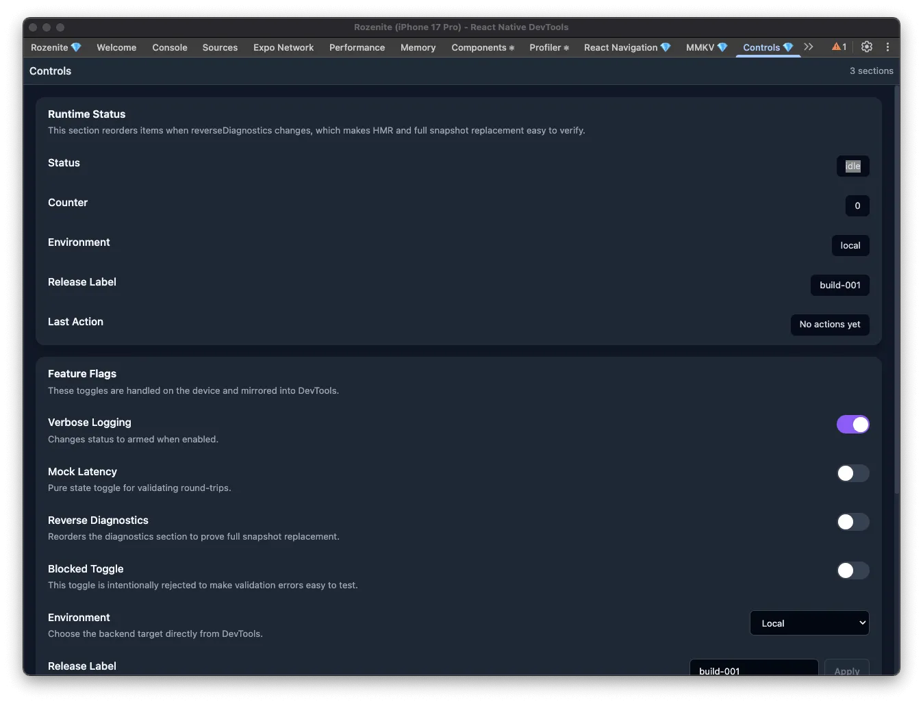
The Controls plugin lets you build your own DevTools panel out of app-defined controls — status fields, toggles, selects, text inputs, and buttons — instead of adding temporary debug screens or hidden menus to your app.
Installation
Section titled “Installation”Make sure to go through the Getting Started guide before installing the plugin.
Install the Controls plugin as a development dependency:
npm install -D @rozenite/controls-pluginyarn add -D @rozenite/controls-pluginpnpm add -D @rozenite/controls-pluginbun add -D @rozenite/controls-pluginBase Setup
Section titled “Base Setup”import { createSection, useRozeniteControlsPlugin } from '@rozenite/controls-plugin';import { useMemo, useState } from 'react';
function App() { const [verboseLogging, setVerboseLogging] = useState(false); const [environment, setEnvironment] = useState('local'); const [releaseLabel, setReleaseLabel] = useState('build-001');
const sections = useMemo( () => [ createSection({ id: 'runtime-status', title: 'Runtime Status', items: [ { id: 'environment-label', type: 'text', title: 'Environment', value: environment, }, { id: 'verbose-logging', type: 'toggle', title: 'Verbose Logging', value: verboseLogging, onUpdate: setVerboseLogging, }, { id: 'environment-selector', type: 'select', title: 'Environment', value: environment, options: [ { label: 'Local', value: 'local' }, { label: 'Staging', value: 'staging' }, { label: 'Production', value: 'production' }, ], onUpdate: setEnvironment, }, { id: 'release-label', type: 'input', title: 'Release Label', value: releaseLabel, placeholder: 'build-001', applyLabel: 'Apply', onUpdate: setReleaseLabel, }, { id: 'reset-session', type: 'button', title: 'Reset Session', actionLabel: 'Reset', onPress: () => { setVerboseLogging(false); setEnvironment('local'); setReleaseLabel('build-001'); }, }, ], }), ], [environment, releaseLabel, verboseLogging] );
useRozeniteControlsPlugin({ sections });
return <YourApp />;}Web (React Native for Web)
Section titled “Web (React Native for Web)”With Rozenite for Web, this plugin is available when you debug your React Native web app.
Once configured, the Controls plugin appears in your React Native DevTools sidebar as Controls. Typical uses: flipping feature flags during manual testing, switching between local/staging/production, resetting temporary app state, or triggering checkpoints for demos and QA — all without adding a debug screen to your app.
Control types
Section titled “Control types”text— a read-only value you want to observe, like status, counters, or a timestamp.toggle— a boolean setting, like a feature flag or logging switch.select— a choice from a fixed list of options.input— an editable text value, like a release label or test ID.button— a one-off action, like reset, sync, or retry.
Organizing sections
Section titled “Organizing sections”Keep diagnostics and editable controls in separate sections, use short titles, and add a description when a control has side effects. Keep section and item IDs stable across reloads so the panel doesn’t jump around.
Validation
Section titled “Validation”Use validate to reject invalid input with a clear message, disabled to keep a control visible but unavailable, and applyLabel to customize a text input’s action label.
Next: Explore other Official Plugins or learn how to build your own in the Plugin Development guide.